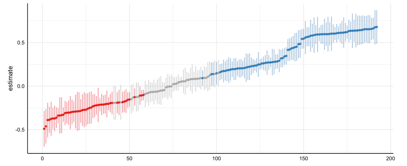
This figure shows the results of a hypothetical multiverse analysis.
On the x axis are the unique analytic specifications. This graph shows 200 unique analytic specifications or unique analyses of the data. Each of these analyses vary in one or more different characteristics.
On the y axis, the estimate of interest. In nutritional epidemiology, this is usually the effect of a food or nutrient on a health outcome.
Each point represents the results for a single analysis. Vertical bars represent 95% confidence intervals.
Points in red and blue are statistically significant and suggest a negative and positive effect, respectively.